As the World Turns
There's cool tool called Gapminder which (if you've got the right Java and plugins) allow you to follow the fortunes of a country over time. A screenshot is of the tool is shown below. I recommend that you use the linear, rather than log settings (in the lower right hand corner) and set the playback speed to the lowest possible. Then let her rip.
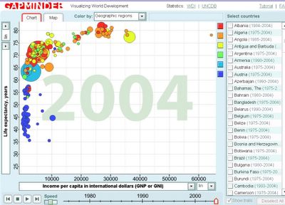
Gapminder
It's instructive to follow the fortunes of the individual countries to see how they do both in absolute terms and in comparison with others. The UAE and Saudi Arabia, for instance, tell a tale. If you start in 1975, for example, you will the UAE, Saudi Arabia and the oil-rich Gulf states level or beyond the US in per capita income as shown below. Then move the slider (bottom of the screen forward to 2004) or play the animation and watch the "oil-rich" countries slide inexorably leftward.
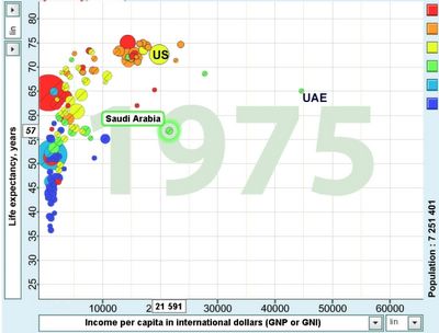
The world in 1975
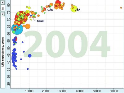
The world in 2004
Visualization allows to spatially "see" things that have no apparent meaning in tabular form. The world in 2004 looks way more laterally spread out than 1975. But in the process, the US seems to have also "broken away" from peloton, though this may be more apparent than real.
posted by wretchardthecat at 6/05/2006 05:30:00 PM
![]()

4 Comments:
Who's the orange dot on the far right of the 2004 plot?
>
Luxembourg
neuro:
Pluto?
It was a moon which orbited earth until it suddenly reached escape velocity in 1988.
Post a Comment
<< Home